#34 – The New Yorker Covers: A Conversation with Françoise Mouly
On The New Yorker cover evolution, hundredth anniversary issue extravaganza, the art editor's mandate and more
This is My Year With The New Yorker Part 2.
When Eustace Tilley popped on the scene with his top hat, monocle and butterfly on the first ever issue of The New Yorker in 1925, Rea Irvin, the art editor of the magazine at the time, set a bold new vision for what a cover can be. The cover would not be related to what is inside the magazine. The cover would have a presence, a life of its own. It would inspire and illuminate, inform and educate, make you think, make you laugh, make you wonder—sometimes, all of these all at once.
At the helm of The New Yorker’s art today is Françoise Mouly, the art editor of the magazine since 1993 and only the fourth person ever to hold this role. Over a Zoom call we had in February, Mouly described the evolution of The New Yorker covers over the past century. The magazine’s earliest covers in the ’20s were primarily Art Deco and reflections of the Jazz Age. In the ’30s and ’40s, the covers focused on life in New York—cafés, bars, nightlife and haunts in the city, and The New Yorker covers became more of visual narratives. By and post-World War II, the aperture of focus widened beyond the city to include depictions of New England. As William Shawn took over the magazine’s editorship in 1952, The New Yorker started growing beyond its comic weekly roots—its articles started expanding in depth and density, its texture rich and rigorous. In About Town: The New Yorker And The World It Made, Ben Yagoda writes that The New Yorker covers under Shawn’s editorship tended to be “pictorial, sober, muted, dark-hued, and often without any human beings.”
When Mouly started her job at The New Yorker in the ’90s, she was tasked with the mandate of rejuvenating the covers by then editor Tina Brown. Over the past three decades, Mouly has overseen more than 1500 covers for the magazine, reimagining and reanimating New Yorker covers by collaborating with a wide range of contemporary artists. Many of these works have been named cover of the year by the American Society of Magazine Editors.
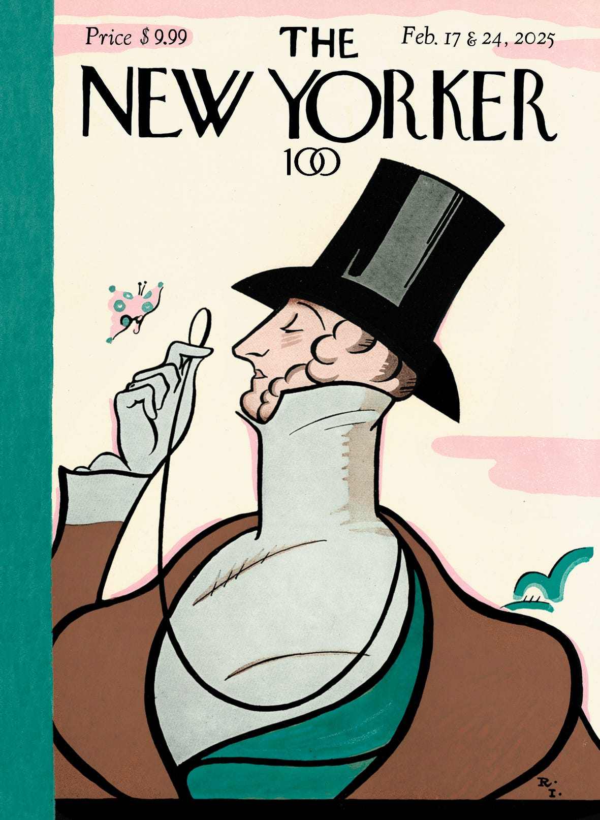
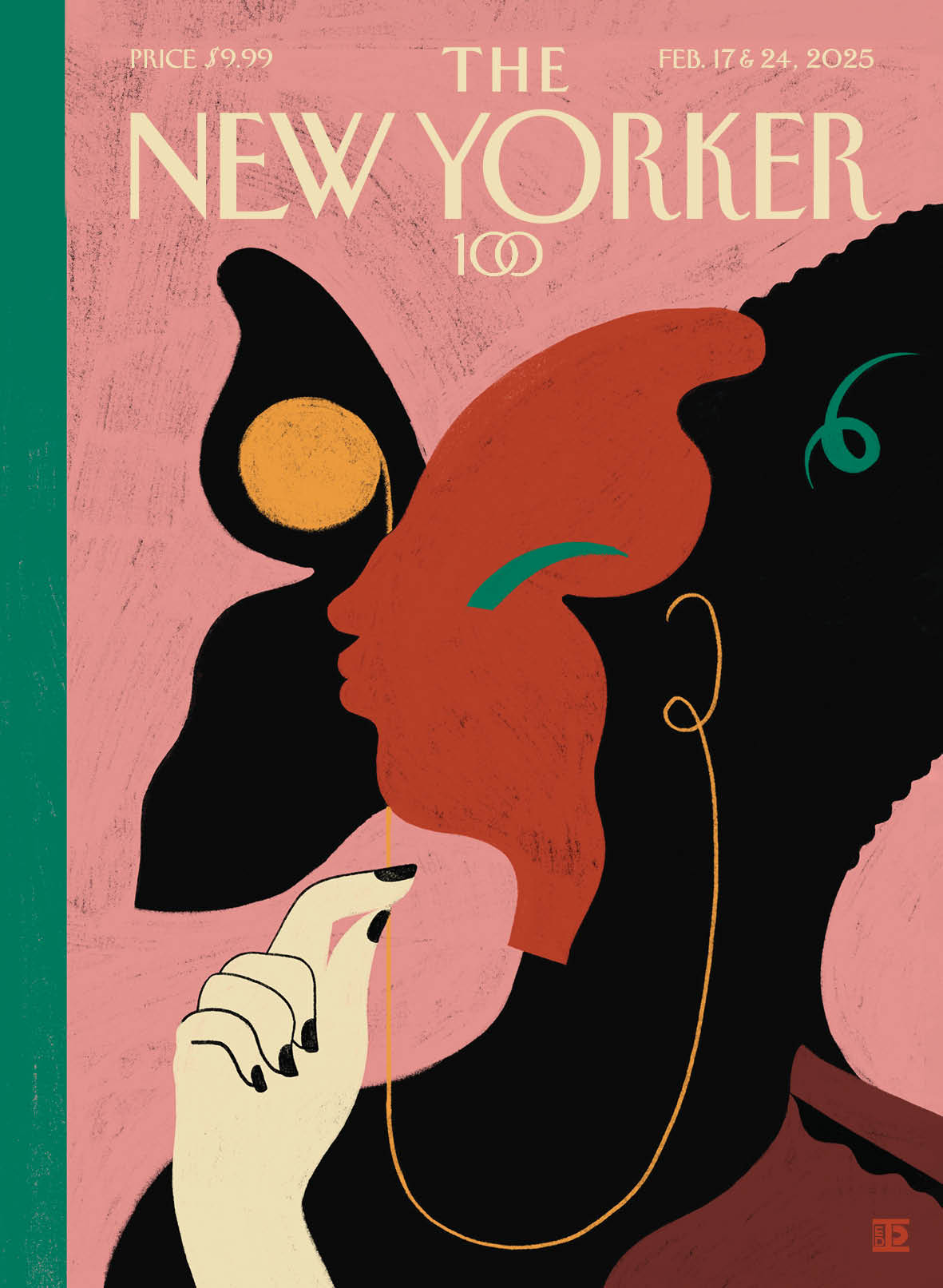
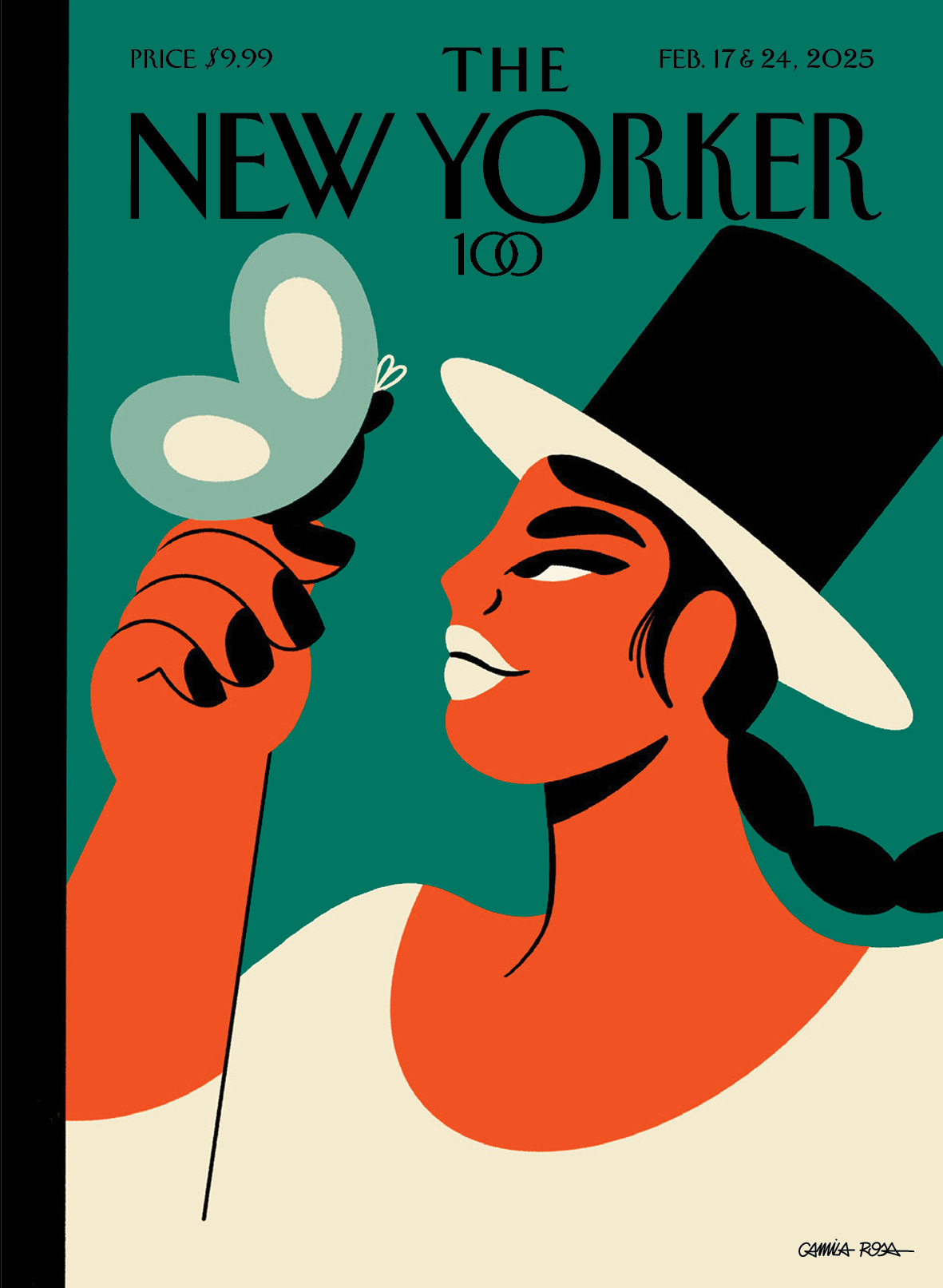
For the magazine’s centenary issue in February, Mouly’s team has gone all out with a cover extravaganza: The anniversary issue has six different covers, with each issue featuring three of them. The first and the third covers are fixed—the first is the original Eustace Tilley by Rea Irvin (emblazoned with 100 at the top), and the third is a re-interpretation of Eustace by Kerry James Marshall, which not only redefines the relationship between Eustace and the butterfly but also invites a reflection on the relationship between humans and technology. In between, the second cover is one of four re-interpretations of Eustace by four different artists from all over the world—Anita Kunz, Diana Ejaita, Camila Rosa, and Javier Mariscal. From reimagining Eustace as a high-collared frog to reinterpreting him as a feminine figure to recasting the beloved mascot as a Latin American woman to simply distilling the interaction into one of innocence, the artists offer a take on Eustace that is fresh, original and unmistakably New Yorker.
In this interview with Mouly, we discuss the evolution of The New Yorker covers, her mandate as the art editor and what it was like working on the hundredth anniversary issue cover extravaganza. The conversation has been edited for length and clarity.
You’ve been the art editor of The New Yorker for about a third of the century the magazine has been in existence. How would you describe the evolution of The New Yorker covers?
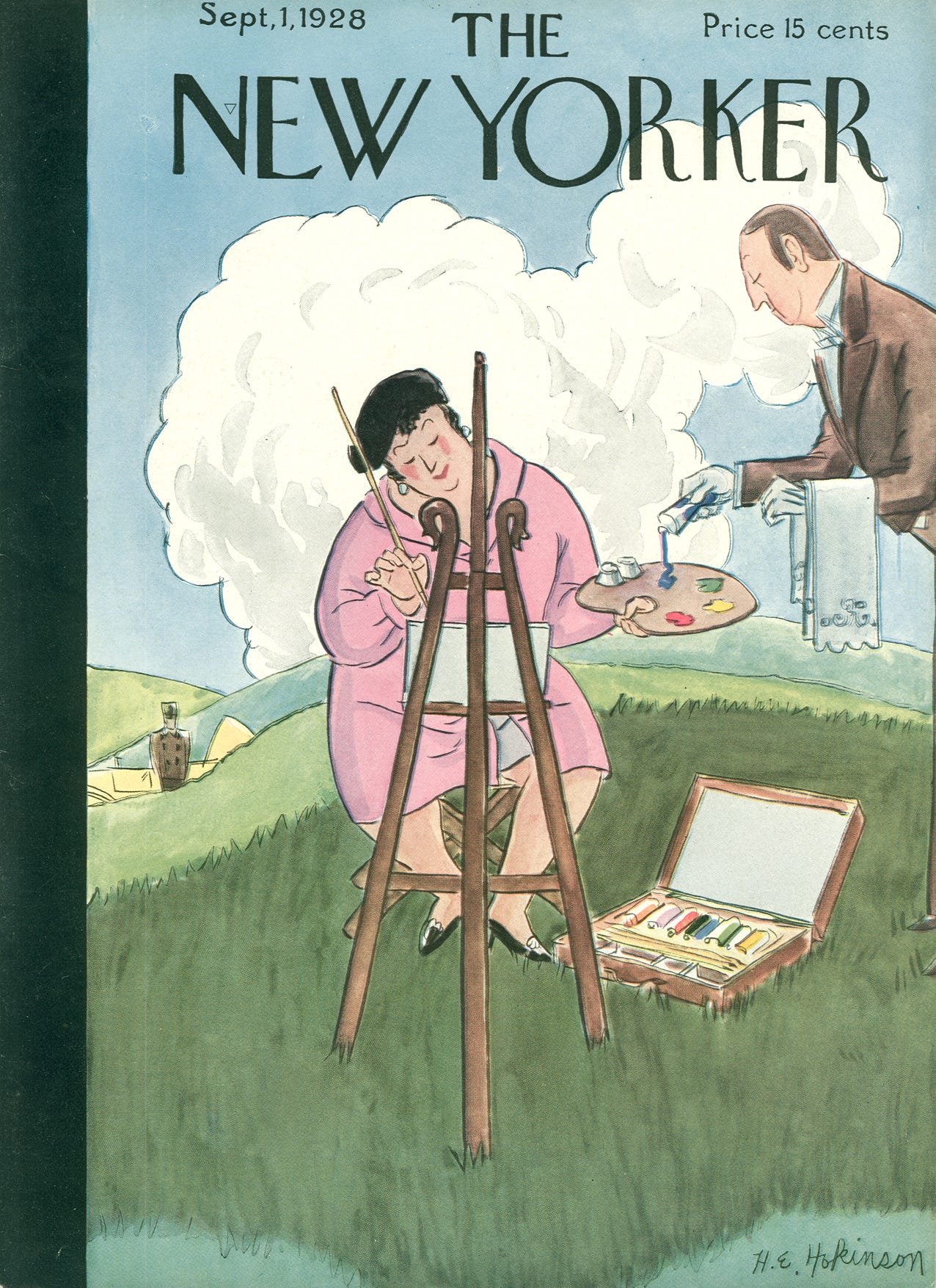
Thirty two years ago, when I started the job, the first thing I did was go to the library, and that's where I discovered the covers from the ’20s that are very Art Deco and quite pretty, and then the covers from the ’30s, ’40s, ’50s and ’60s, by the likes of Peter Arno, Helen Hokinson and Mary Petty. Those are visual narratives, and those were genuine inspirations for me. Through a series of images, the covers conveyed the experience of what it was like to be alive at the time. It made me want to work with contemporary artists to do something similar to what had been done for 30 or 40 years.
There are many different traditions at The New Yorker—that's part of what makes our strength. And there are many different versions of the magazine. In the early years of The New Yorker, it was more of a humor magazine. It was only during World War II that reportage became an important part of it, and it shifted away from Harold Ross’s vision, which started as a comic weekly and a humor magazine. When William Shawn took over the editorship, the magazine entered a new period in terms of visuals—if you think of the Art Deco covers as a first period and the second period as narrative images. Shawn's stated philosophy was that the cover should be a welcome respite from the chaos of the world. Many of these covers were not temporal in that they did not reflect what people were going through at the time.
Can you describe the covers of this period?
The New Yorker of the ’20s is very much about New York City. It's the Jazz Age, and it’s centered on life in the city. There’s life in the Lower East Side or nightlife on Broadway. There are a lot of cafés, bars, and nightlife because that was one of the focuses of the magazine. By and post-World War II, you see the artists moving out of the city to Newport, Connecticut, Massachusetts, or New England in general and becoming commuters or visitors to the city. You see young people arriving in a rural environment and eventually settling there, and their trips to the city become very different. They have the attitude of a tourist, like “Isn't that a charming little store?” as opposed to “Here's a picture of the swells in the slums.” The artists see New York City with more of a detached, amused eye. A lot of the stories that are told are those of would-be country gentlemen or gentlewomen who are living in New England and go to a hardware store, an outdoor market and so on.
What were The New Yorker covers like when you started your job in 1993?
When I came in in the ’90s, The New Yorker was famous for having drawings on its covers, but most of them were whimsical: often pastoral and anecdotal scenes. When Tina Brown was asked to become the editor, she was specifically given a mandate to rejuvenate what had gotten somewhat fossilized. The New Yorker had pictures of hippies sometime in the early ’70s, but they are kind of like tourist pictures of young people with long hair and flowers in their hair—none of the important artists from Underground Comix, for example, were invited into the magazine. It was aging together with its artists and its readers, and it didn’t reflect the lived reality of the people who were driving the culture at the time. The median age of the readers in the early ’90s was quite old. It skipped the entire Baby Boomer generation, and it was about to skip the Millennials who were coming of age around that time.
So what Tina Brown did, and what my mandate was, was to bring in artists like Art Spiegelman, my husband, and some of the artists that I had published in RAW, which was my own comics and graphics magazine. I brought in a whole lot of artists who had never been published, such as Bruce McCall, Maira Kalman, Ian Falconer or Barry Blitt. I also discovered a lot of artists whose work was refreshing and has never been shown.
What has been your mandate as the art editor of The New Yorker?
The mandate that I gave myself ever since I started this job has been to not let the magazine settle into a new, predictable house style. What I am most proud of accomplishing is that there is still a surprise every week for readers. After 32 years, we’ve not grown into a pattern, a look or a consistent approach—the images are always interesting, but they are different from each other. You don't know what is going to be on the cover, either in terms of subject matter or stylistically. There is such a range and diversity, and that is something that keeps it alive for me.
What was the process like working on the centenary issue covers?
Two years ago, when I saw that the hundredth anniversary was approaching, I wanted to talk to artists who are doing some of the best work out there today. I love Kerry James Marshall's work and I feel a sense of kinship with him because he is someone who is devoted to making images for print. He does his own prints, and that is not true of every artist who has success in the fine art world—there are people who specifically will stay away from doing images for print because they regard it as too democratic or too downmarket for them.
And last year, David Remnick, the editor of The New Yorker, came to see me to say, “I've made a decision. We're going to have the image by Rea Irvin on the cover.” If that had been the end of it, that would have been hard for me because the printed issue would have felt flat if it only had that one image that had been reprinted for nearly 70 years, year after year, in February. And I understand the pressures on David—many readers want to see that image because they are used to it.
Fortunately for me, because I've been around for a long time, I was able to resuscitate something that we used to do when we sold more ads, which is to do multiple covers. I was blessed to have some colleagues who remembered how those things were done. They knew what I was after and went to the same advertisers. I made dummies with my assistant Genevieve Bormes. Genevieve has embraced my passion for print, so we glued, cut and made mock-ups that showed what an issue could be like with more than one cover. We included Rea Irvin’s original cover along with a diverse range of artists who offered a fresh take on Eustace Tilley: Anita Kunz, who is based in Toronto and has been contributing covers for many years; Diana Ejaita, a graphic artist who works between Lagos, Nigeria, and Berlin, Germany; Javier Mariscal, an old friend from the RAW days based in Spain; Camila Rosa, a Brazilian artist contributing her first cover to The New Yorker and Kerry James Marshall, one of the greatest artists living today who’s based in Chicago.
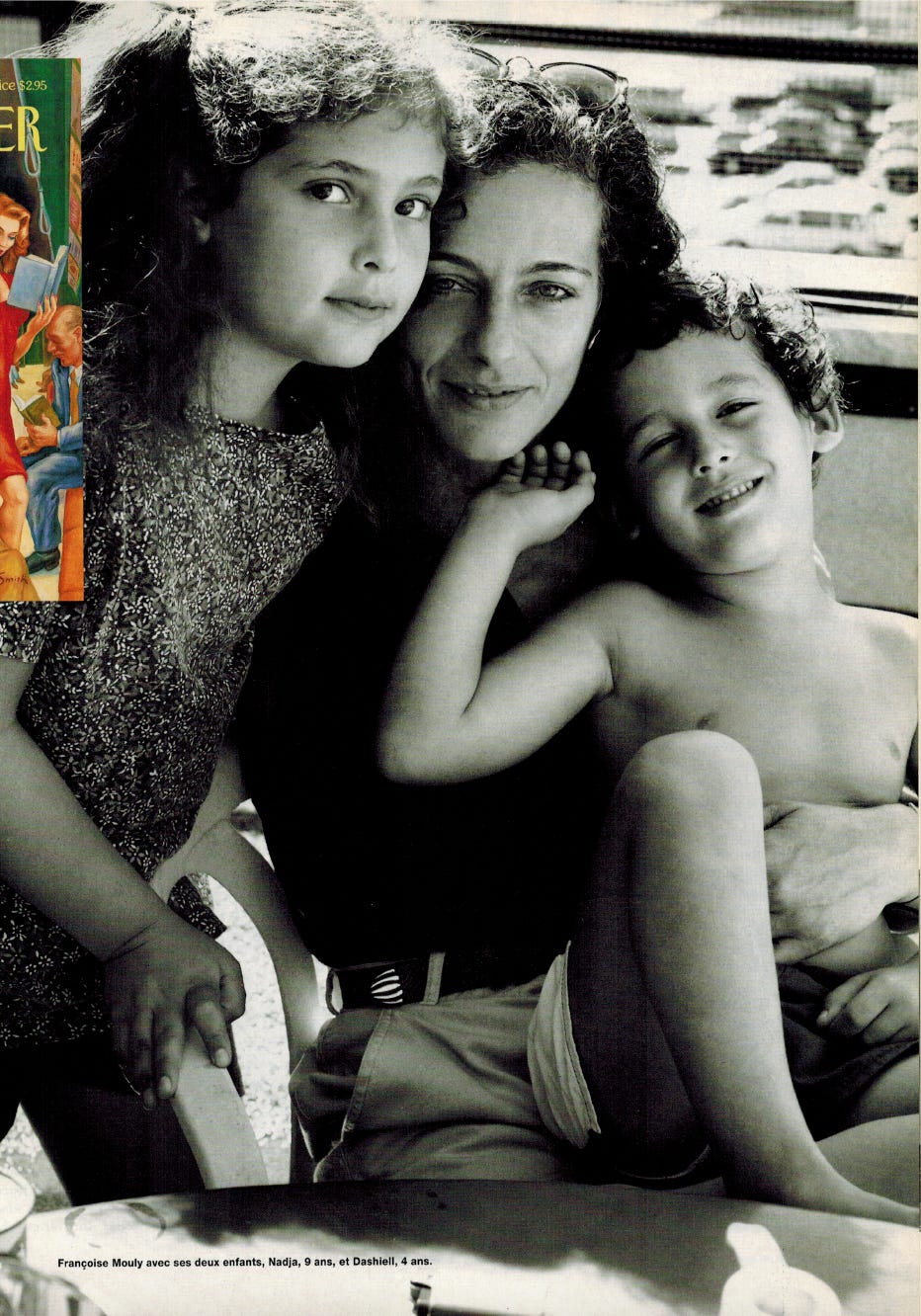
What inspires you as an art editor?
I'm very oriented toward anything that I can touch. I love the process of conceiving something, working on it, making it happen and having it printed. I studied architecture many years ago, and those years as an architecture student have made me aware of how magical and powerful it is to bring something physical into the world—unlike a practicing architect, you can imagine an issue of a magazine, you can imagine a book, you can imagine whatever you’d like, and you can make it exist in the world.
What is your favorite thing about The New Yorker?
Its respect for its contributors and the fact that so many good things come from this group of people. We have some of the most well-read, funny and intelligent people that one could hope for. It's true for the artists, it's true for the writers, it's true for the staff members, and it’s true for the readers—we don’t have to explain or dumb things down. Everybody is very dedicated to the quality of their work. From the legal department to the editors to the checkers, it is such a pleasure to work with everyone. A magazine is a gathering of people who have a common interest, and because we are a general-interest magazine, the interests range from poetry to reportage to cartoons. It’s a real privilege to work with this wonderful group of people for readers who are willing to be surprised and challenged.
Here are the six covers for The New Yorker’s hundredth anniversary issue:
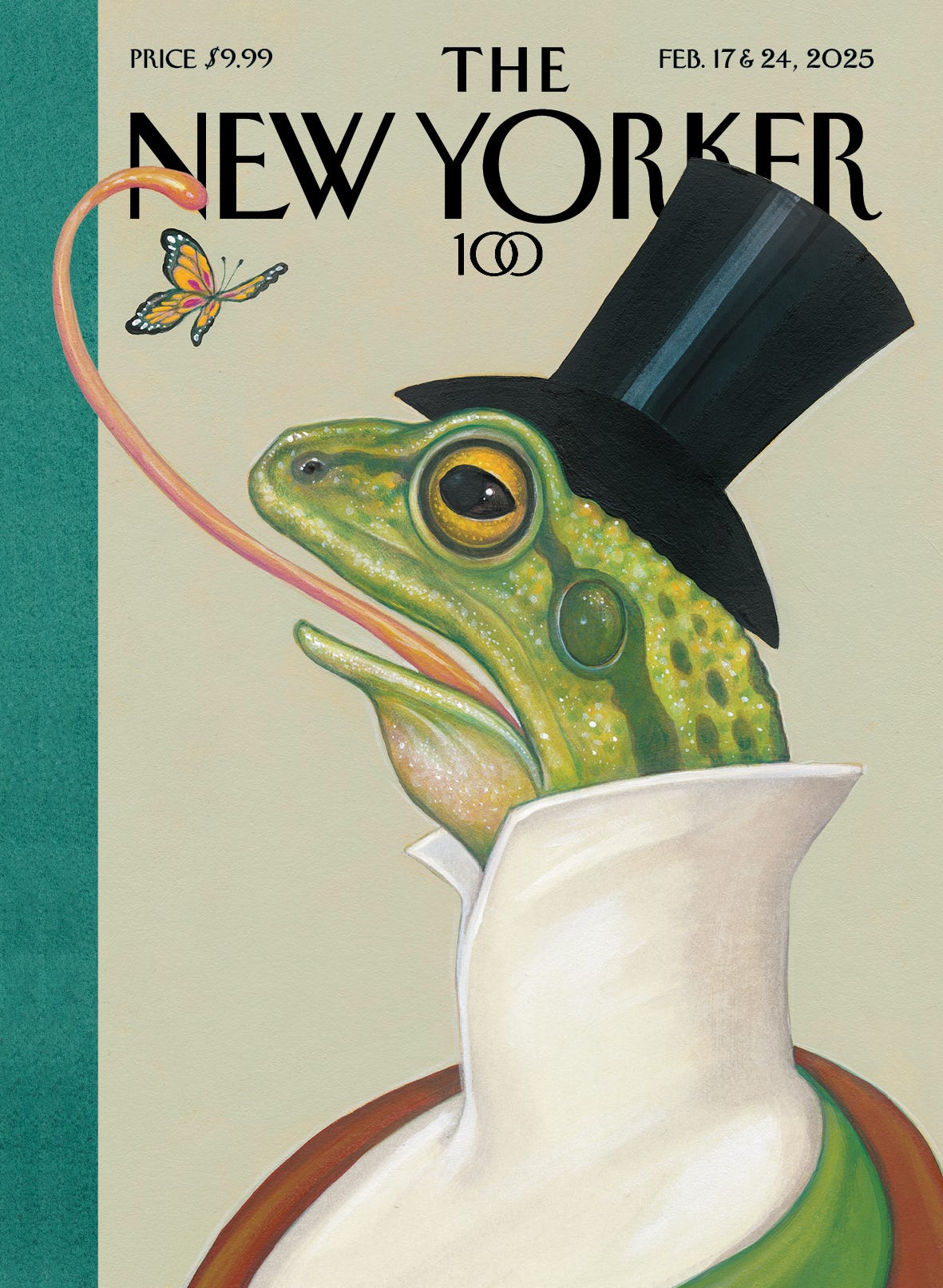
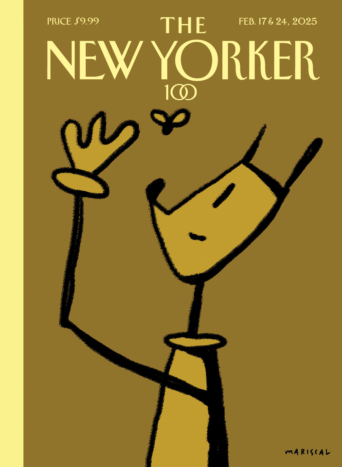
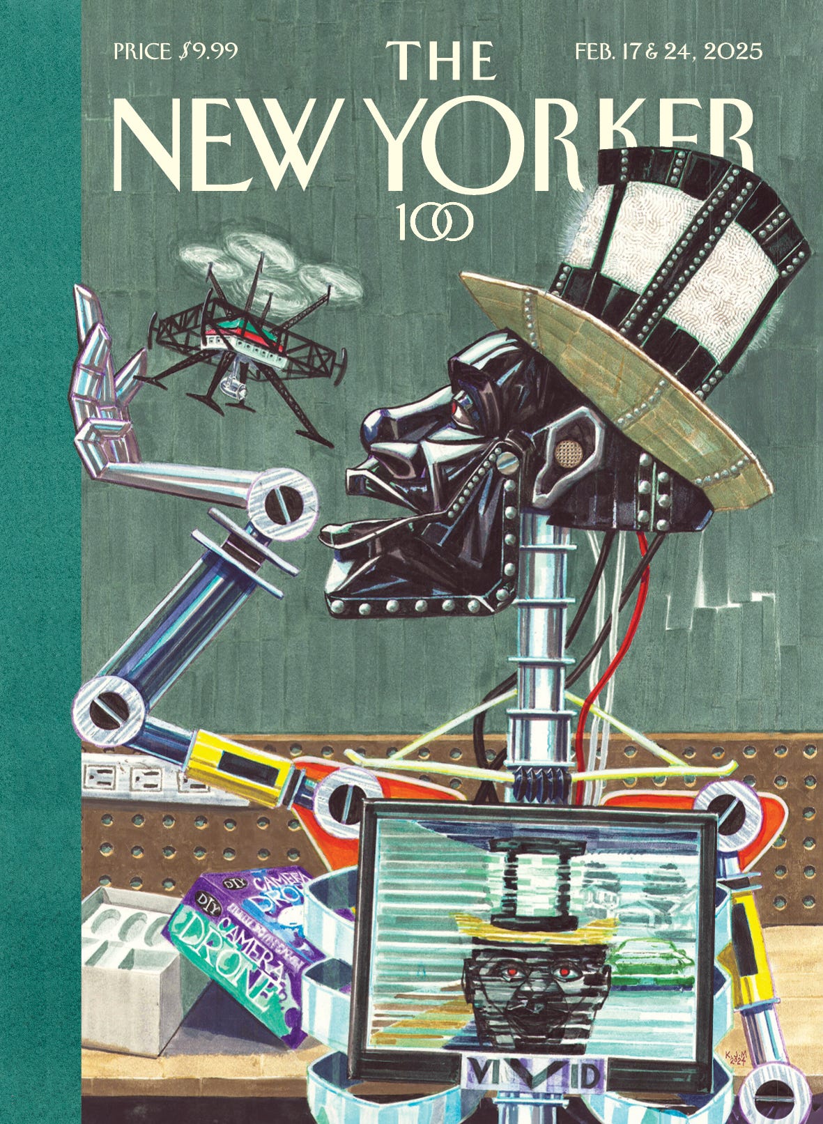
A look back at The New Yorker covers from the ‘20s, ‘30s and ‘50s:
All cover images courtesy of The New Yorker. Used by permission. All rights reserved.




This bit was my favourite: "The cover would not be related to what is inside the magazine. The cover would have a presence, a life of its own. It would inspire and illuminate, inform and educate, make you think, make you laugh, make you wonder—sometimes, all of these all at once." It made me want to read ahead and also go and pick up some issues for myself! As a writer, this glimpse into art and cover direction was super interesting.
I was first drawn towards The New Yorker because of their covers and illustration within pieces. So, getting an insight into the process and behind the scenes workings was delightful. Loved this!